When you think of great marketing campaigns, you might first think about the ads that dominate the Super Bowl or destination videos that have us craving an escape. But are they really the best ads we have seen? Charity’s have contributed to some of the best ads we have seen in recent years, with their causes and calls to action etched in our minds forever. Today we are going to relive some of the best charity marketing campaigns from around the world and discuss why they are so effective and emotive in their ability to cut through the noise.
Whether you love ads or are an aspiring advertising professional – we think you will get some inspiration from these ads!
The Hunger Project
The Hunger Project is an organisation on a big mission, but its aim is simple. They are working towards ensuring every man, woman and child lead a healthy, fulfiling life with dignity. They do this by working with people to donate to feed the hungry in India and other countries facing poverty. Unlike other charities working to end hunger, The Hunger Project is about equipping communities in India, Bangladesh and other impacted countries with the tools they require to end hunger in their own countries. It’s about empowering humans to establish systems in their country, providing a solution that addresses the root cause rather than simply feeding the masses. Their 1980’s ad is a great demonstration of what hunger looks like in children, with the entire ad focusing on a skeletal boy who gradually gains weight and looks well-nourished by the end of the ad. The narrator also says that hunger will end in this century, with the black and white ad turning colour as the boy is eventually healthy.
The marketing and fundraising efforts of The Hunger Project are vast, and we especially love that they have hampers and gift packs available that allow users to buy brands they love with all or some of the proceeds going to the organisation. In the same way, they are thinking beyond just feeding people today, they also recognise that they are more likely to get financial support if Australian’s can buy a tangible. They have also cleverly only partnered with premium Australian brands, appealing to those wishing to support Australian and local businesses.
Australian Red Cross’ “42” campaign
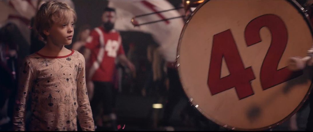
See it here.
This ad never fails to bring a smile to our face, as it’s a great example of a child’s imagination. A boy is going to sleep and dreams about a magical place with the number 42 being celebrated. In the book The Hitchhiker’s Guide to the Galaxy, the author wrote that 42 is “the answer to the great question of life, the universe and everything”. The ad echoes the book here, as 42 is the number of days that blood can be kept for a donation, and the ad ends with the boy actually being in a hospital, and not in his home. What we like most about this ad is that it’s a beautiful balance between inspirational and heart-wrenching, depicting the incredible value of a blood donation.
This television ad was also backed up by some creative outdoor advertising, with ‘42’ seen spray-painted around Australia, on posters around the city and there was even some skywriting. This is quite a creative take as the ‘42’ outdoor advertising was meant to make people think ‘what is the meaning of 42?’ We love this as a campaign and it’s pretty effective and more imaginative than the usual, but still valid, ‘donate blood’ message.
Movember’s “Un-mute – Ask Him” campaign
There is a real beauty to the simplicity of this ad, and there is every chance that some people would have missed the message and scrolled right by. It’s a male who appears to be conducting a ‘how-to’ video, with the subtitles supporting that as he shows the audience how to change a bike tyre. When you unmute, he is actually opening up about his mental health issues. This kind of ‘if you know, you know’ element really pushed the shareability of the ad with people resonating with the message and also wanting to show that they caught on to the hidden message and hit un-mute. After all, how often do we interact with our phones on mute and rely on what the subtitles are saying?
This fact legitimises the ad, and it is an interesting way of exemplifying the ways in which men are not forthcoming with mental health, and that asking (or “un-muting”) is necessary. This ad launched 2017’s Suicide Prevention Day, which is especially impactful given that suicide is the number one reason for death for Australian men. We think this ad could run again with even greater success, as captions are even more a part of our daily lives than they were in 2017.
World Wildlife Fund: #EndangeredEmoji
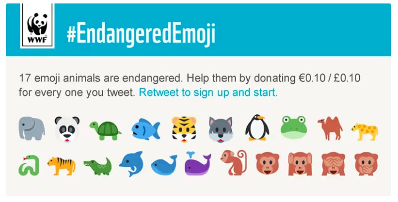
What a world we live in that Emoji’s are contributing to a cause close to all of our hearts, endangered animals. WWF went out with a marketing campaign in 2015 that communicated that “17 Emoji animals are endangered, help them by donating €0.10 for every animal you Tweet.” This very cleverly engages a younger generation who might be more likely to use Emojis, and it also prompts other Twitter users to uncover why people are Tweeting with this collection of animals. The campaign also allows users to be part of the movement, and give them an activity of choosing which of the 17 animals to Tweet, allowing for creativity.
Another great thing about this marketing campaign is the relatively low cost it would have, as WWF is setting the stage for Twitter users to actually push and share their message. As important as a compelling ad can be for a charity, spending always needs to be mitigated so that the funds can be directed at the cause more. If your message is fun and relevant enough that the marketing is spread by your audience, then you are doing it right!
Metro Trains Melbourne: Dumb Ways to Die
Ok, so this isn’t so much a charity as it is a public service announcement, but we had to include it! The Dumb Ways to Die campaign appeared on television and through outdoor advertising in 2012, and this very catchy song and hilarious cartoon cover several “dumb ways to die”. Some include things like taking off your helmet in space, jumping into Parana-infested waters, with the crescendo being train-related deaths. Melbourne city has always pushed safety messages to its community around level crossings, train tracks and many other issues, but we think this might be the best way to present the issue.
Not only did this ad go viral but there were plush toys that you could buy also. It showed that humour can be used to convey a pretty sombre issue, and it drove home the fact that getting hit by a train is a dumb way to die and very avoidable. We also think this ad stands out because it is animated, and would have presumably run between live-action ads. The song is actually very well done and beats a jingle many times over.
#KnowYourLemons Worldwide Breast Cancer
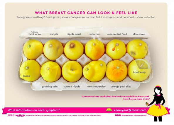
It’s no secret that Instagram and Facebook have some pretty prudish rules when it comes to the photos you can upload, with breastfeeding pictures and women in scant bikinis being reported and their content removed. This is why the #KnowYourLemons breast cancer campaign is so clever, as it is clearly breasts we are looking at in the egg carton creative. The message is clear – while everybody is different, it is important to know how your body is different so that you can see what is normal for you or what could be a lump that needs to be checked with a mammogram. This campaign is also a playful way to approach a very serious message, and it is fun for all generations and genders.
An advertiser is always looking for ways to convey a lot of information in one piece of ad creative, and when you quickly realise what the ad is trying to do… it is hard to see anything other than breast. So, well done to Worldwide Breast Cancer on making this issue something shareable and relatable to its intended audience.
Second A Day (Save The Children)
I challenge anyone to watch this ad and not have an emotive response. A young girl is central in the ad, and the audience sees her life one second at a time – her birthday, fun at the park, school, sleepovers and just being a normal kid at home. As the ad progresses we start to see that the news is on more often at home and the parents are arguing, with the ad eventually turning serious with the girl and her family fleeing the house. The situation turns more sinister as we see bombs going off behind the girl, people running and her living conditions slipping to a point where her father is gone and she and her mother appear to be in a housing complex.
It’s clear to see why this ad is so effective, as the audience creates an attachment to the girl as we have a glimpse into her life. This is such a fantastic way of actually demonstrating what happens in a war and how quickly things can evolve for communities in war-impacted countries. People find it very easy to ‘other’ these sorts of circumstances, so the Second A Day ad forces the audience to see just how unfortunate children have it.
UNICEF: Tap Project
Sparkling water or tap? It’s a question you get asked at every restaurant or cafe, and UNICEF capitalised on that fact and raised $6 million from their Tap Project campaign. Participating partners all asked customers to donate $1 for their tap water to help children have access to clean water, helping over half a million people. The small cost of $1 in exchange for a bottle of tap water at a cafe or restaurant is not a big ask, and it doesn’t require society to do an additional task or commit to anything large. UNICEF has created such a clever campaign here, and one that really only requires some posters and POS (point of sale) so that customers know what is going on, and so business owners can pass on the raised funds.
Naturally, the fact that it is water that is being ‘bought’ really drives home that we are privileged to have access to clean, fresh tap water at no cost to us. This campaign kicked off in 2007 in World Water Month and we think it should be done every year, as it’s such an easy way to contribute to such an important cause.
The Tap Project also included a pop-up activation in New York City, with a vending machine going up with a sign saying ‘Cholera For Sale’. The idea is that people would put in $1 to go to UNICEF and in return, they would get a bottle of dirty water. The activation really created some classic reactions from the New Yorkers who were happy to donate, but not happy to drink the dirty water – obviously! We love this concept because it is all well and good to hear about dirty water, but seeing a clear water bottle full of it in your hand really drives home how unsafe it really is, and how unfortunate the people are who are have no other option
~
We hope you have liked these ad campaigns, as we think they are some of the most clever we have ever seen! With a range of charities covered, we hope you can get some inspiration and apply some of these creative concepts to your work or personal life!
