Every time I pass this sign in Seattle, I think of something that I am pretty sure the proprietors of this small business were not going for. In fact, they’re going for the exact opposite.
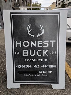
Maybe it’s the years in tactile marketing, focusing on hands, but every time I see the sign for this accountancy firm, the antlers remind me of the Mr Burns’ perched fingers gesture. Eeeexcellent. On an emotional level, I fear this business. Irrationally, I associate it with “evil”.

I also associate the vertically stretched typography on a black background with “pinstripe suit”, “corporate” and “filthy lucre. For me, image association and symbolism gone wrong
When I showed this to a friend, they said the logo and text made them think of an independent beer. Seattle is a center of craft beer, so I can see why. Deer = nature = manliness. And yes, there are breweries who use this in their logo!
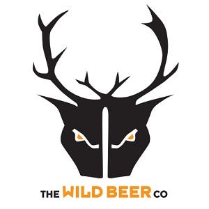


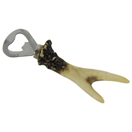

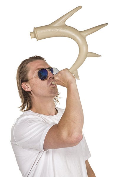
Then we hit products that love the portmanteau of Deer + Bear = Beer.
Jackalopes, eat your heart out.


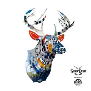
Or just look up Beer Deer on Etsy.
So there you have it. Antlers = beer in America for some reason.
…And cute accessories for your pet.


