Advertising has existed for centuries. From signage, newspapers, television, and now on social media, brand advertising by businesses has influenced us into buying their products more than ever. One tactic that evolved over time is that of the brand mascot, to help create brand awareness, improve brand recognition, and build brand reputation, all of which increase products and sales from both new and repeat customers.
Today you see a lot more brands trying to market their products on their merits. Historically, there was more emphasis on creating a brand around a “face,” like the Aunt Jemima character, based on the enslaved “Mammy” archetype. Mascots, whether real-life or fictional, realistic or surreal, are proven, effective ways to instilled (sometimes sear) a brand image into consumer minds. In their quest for better brand recognition, recall, and reputation, mascots are redesigned, phased out or retired, sometimes as people realise just how creepy they were. Or as in the case of Aunt Jemima, companies reckon with their racism.
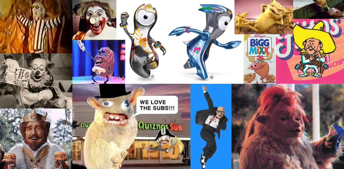
Here is a list of some of the weirdest and creepiest corporate mascots from around the world, many of which are still around in much less creepy incarnations today.
Krinkles The Clown
Country of origin: United States
Year: 1956
Image Source: The Georgia Straight
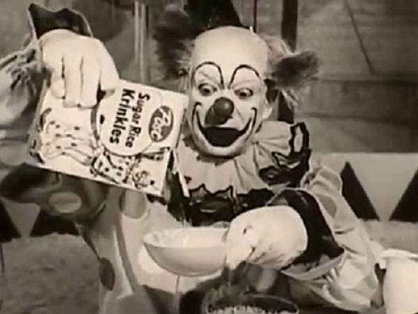
If you live in the USA, your parents or grandparents might have seen the commercial of Post Sugar Rice Krinkles in 1956. More than the cereal product itself, the product was infamous because of its clown mascot who crinkles when eating the cereal. Some may have found it cute, but others were creeped out by the face of the clown itself. Clowns have always been creepier than intended. Except for clowns in horror movies, and the evil clowns (of various kinds). Those are precisely as creepy as intended, and are largely inspired by the terrifying existence of real-life serial-killer clowns, like John Wayne Gacy. “Coulrophobia” is so common that according to a Vox poll, Americans are more afraid of clowns than climate change, terrorism, and … death. As a result, clown mascots are rarely used at all today.
Ronald McDonald’s original design
Country of origin: United States
Year: 1963
Image: Vintage Everyday
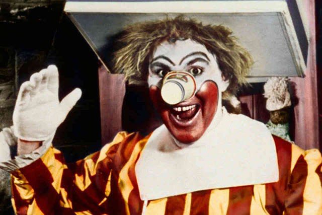
Ronald McDonald was the face of the fast-food chain McDonald’s until 2014. He was very popular when the fast-food chain first introduced him in 1963, with redesigns lasting as little as 2 years, and as long as 14 years. He originally looked like a clown who woke up in a McDonald’s dumpster with a cardboard box for a hat, pieces of straw for hair, a paper cup for a nose on top of an early version of his typical makeup and clothes.
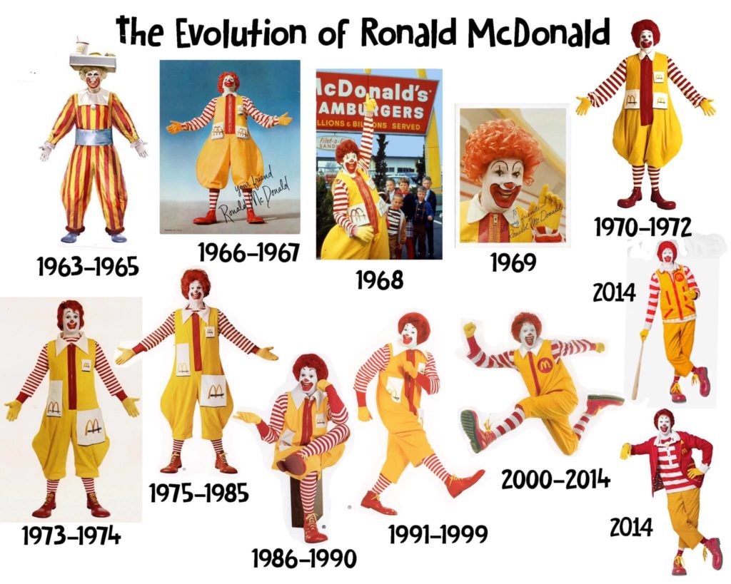
Friendlier, more modern designs quickly came in and helped launch to brand to international stardom. However, with the waning of circuses as a common form of entertainment, as we mentioned above, clowns are now more likely to appear in horror movies than children’s entertainment. It could be argued that IT’s Pennywise has more than a few similarities to this beloved icon, and with so many iterations of the character, you could start seeing something Ronald had in common with the many interpretations of The Joker. With increasing scrutiny over junk food being marketed directly to impressionable children, having a clown mascot because harder to justify.
Ronald’s modern forms have not been used much since 2003 and was officially retired in 2016 but still lends his name to the Ronald McDonald House charity, and you can still see the character once a year at Macy’s Thanksgiving Day Parades.
Ronald McDonald’s 2014 Redesign
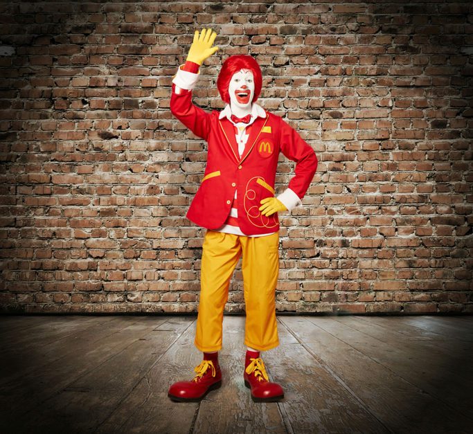
Slate called him terrifying. The LA Times called him creepy. In one final attempt to keep the character consistent with McDonald’s new adult-targeted branding and décor, and make him less kid-focussed (and the company less under scrutiny for unethical marketing practices,) out went the surreal combination of delightfully garish stripes and yellow mustard jumpsuit overalls, and in came an uncanny valley not-quite-right combination of shirt, pants and jacket in the old familiar colors.
McDonald’s commissioned Tony Award-winning costume designer Ann Hould-Ward to take a beloved surreal character aimed squarely at children, and turn him hipster, not only ruining both a constant mainstay in people’s minds, but also ruined nostalgia for millions. The widely panned wardrobe update was a final nail in the coffin for the character as a whole.
There is one place Ronald McDonald was used with great acclaim in 2014 though – a Taco Bell ad which featured real people named “Ronald McDonald” across the US endorsing their new burger.
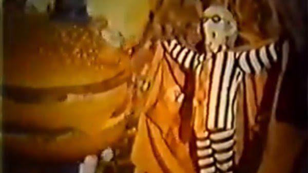
McDonald’s Hamburglar’s original design
Country of origin: United States
Year: 1971
Image: Mashed.com
Just when you thought that old mascots in McDonald’s couldn’t be weirder, you have got to check out the original Hamburglar. For some reason, McDonaldland needed some antagonists to add some drama to their commercials. The Hamburglar has always been known for taking all of Ronald’s burgers and being generally sneaky most of the time. However, the cute faced Hamburglar most of us are familiar with started out differently. Instead of a child-friendly mascot, he started as a genuinely unsettling, sinister-looking elderly man with long and grey hair, with yellow and wood-like teeth. McDonald’s had to change him into something more child-friendly for the sake of both children and parents. McDonald’s did a lot of versions of the Hamburglar before settling on the cherubic mischief we know today.
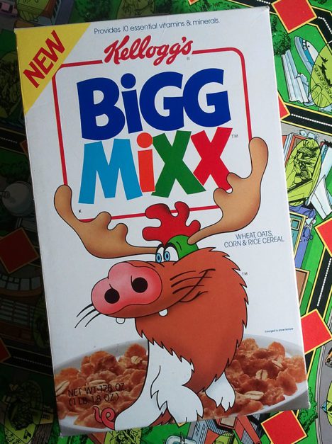
Kellogg’s Bigg Mixx
Country of Origin: United States
Year: 1990
Image Source: Dinosaur Dracula (ps. check out the Purple Stuff Podcast)
This Kellog’s product was one of the biggest US cereals of the 1990s. Bigg Mixx’s cereal recipe was a “big mix” of different cereals put into one, so kids would be able to enjoy an extra-exciting taste and texture for breakfast. With this, Kellogg’s came up with an idea to also incorporate an animal character with different mixes of animals, thus the character Big Mixx was born. Sired? Birthed? Spawned. Let’s go with spawned. The character confused many. Is he or she a moose, pig, and chicken? What unholy creature hath the Kellog’s corporation unleashed upon this world, and will we all be forced to pay for their sin? This confusing mascot was more akin to gene-splicing gone wrong than a mascot a child could comprehend. But then again, most kids probably don’t think too hard about the origins of cereal mascots, or their place in the tree of evolution.
The King (Burger King)
Country of origin: United States
Year: 2004
Image: YouTube
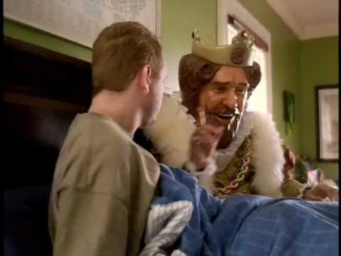
Other brands usually utilize cartoon characters or actor-portrayed characters to promoted their products. In contrast, Burger King proved there’s a hybrid that can be forged, possibly with a little help from Beelzebub himself, when they made the bold move to have a live-action mascot wear an oversized semi-realistic static head. The character itself isn’t too creepy out of context but a commercial made by Burger King in 2004 gave people chills. The advertisement attempted to boost sales promoting their bacon and cheese breakfast burger, which on its own is fair enough. However, the final ad featured a the aforementioned merging of cartoon and reality real-life-sized, dead-eyed “king” staring and waiting for a man to wake up before handing him the burger. Whilst I’d have no issue with this if it happened to me, most people found this pretty creepy…
Living in Australia, we have Hungry Jack’s rather than Burger King, and we never had this mascot here, but I always found this character interesting at the time, especially given the King Games series on the original Xboox and Xbox 360 – Sneak King, PocketBike Racer and Big Bumpin, which sadly did not work on my Australian gaming consoles.
The Gobbledok (Smith’s Snackfood Company)
Country of origin: Australia
Year: 1987-1994
Image: Kill your Darlings
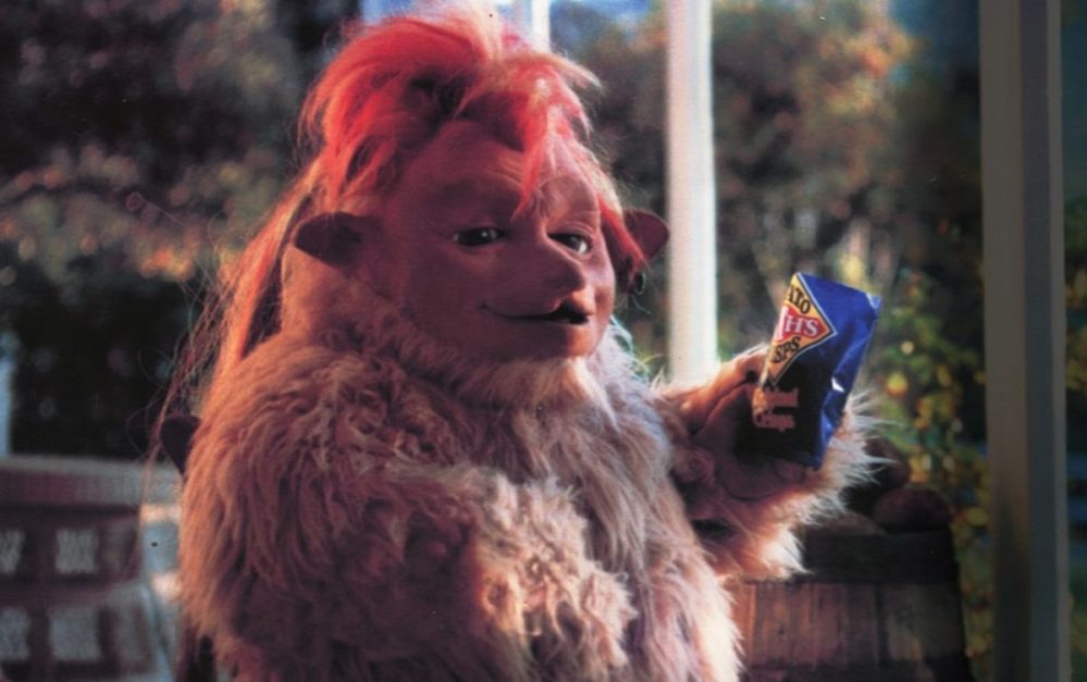
This widely popular series of ads by Australian Smith’s Snackfood Company featured Gobbledok, a fictional alien covered in fur and an insatiable love for Smith’s chips. Played by human in a fur suit, it was reminiscent of popular Hollywood puppet characters such as those in Star War, Alf, or many of Jim Henson’s many creations. Gobbledok commercials show how their potato chips are made fresh and that even something from out of this world would want the irresistible goodness of the product. Gobbledok sneaks inside houses to steal people’s snacks and runs away with a weird “Chippie, chippie, chippie” sound. Not quite a slogan, the sonic branding of this mischievous catchcry is simultaneously creepy and loved by millions. The character also moves fast and can disappear in just a blink of an eye. Whilst many loved the character, some found the character odd-looking, perhaps due to its rubbery semi-humanoid face.
California Raisins (Sun-Maid)
Country of origin: United States
|Year: 1986
Image: YouTube
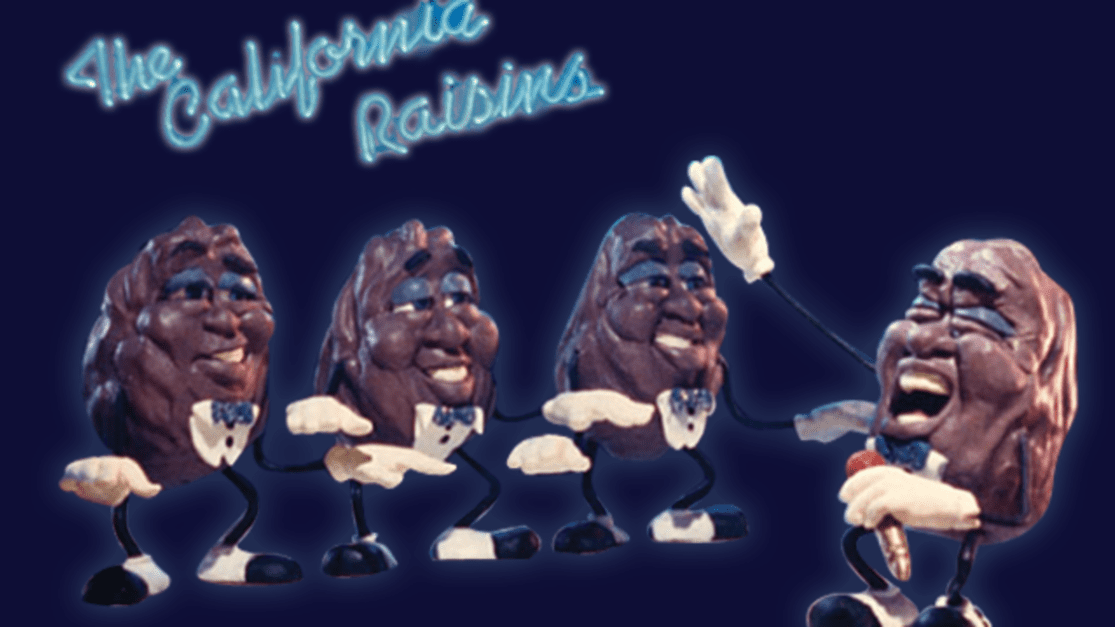
The California Raisins are a dancing and singing group advertising Sun Maid’s Natural California Raisins. Whilst their design isn’t initially creepy, it’s weird seeing anthropomophised raisins with hands and feet synchronized dancing while singing the Sun Maid jingle. Like The Hitchhikers Guide to the Galaxy’s cow that wants to be eaten, these dried grapes were selling themselves as delicious food. First introduced on TV in 1986, they made a name with catchy songs that are all about raisins. It doesn’t help that their wrinkly faces, body structures and nostalgic make them look like old men, and the sleepy eyes and a deformed face structure make them look rather sickly. Would such a design make it past test audiences and focus groups today?
Spongmonkeys (Quiznos)
Country of origin: United States
Year: 2004
Image: Pinterest
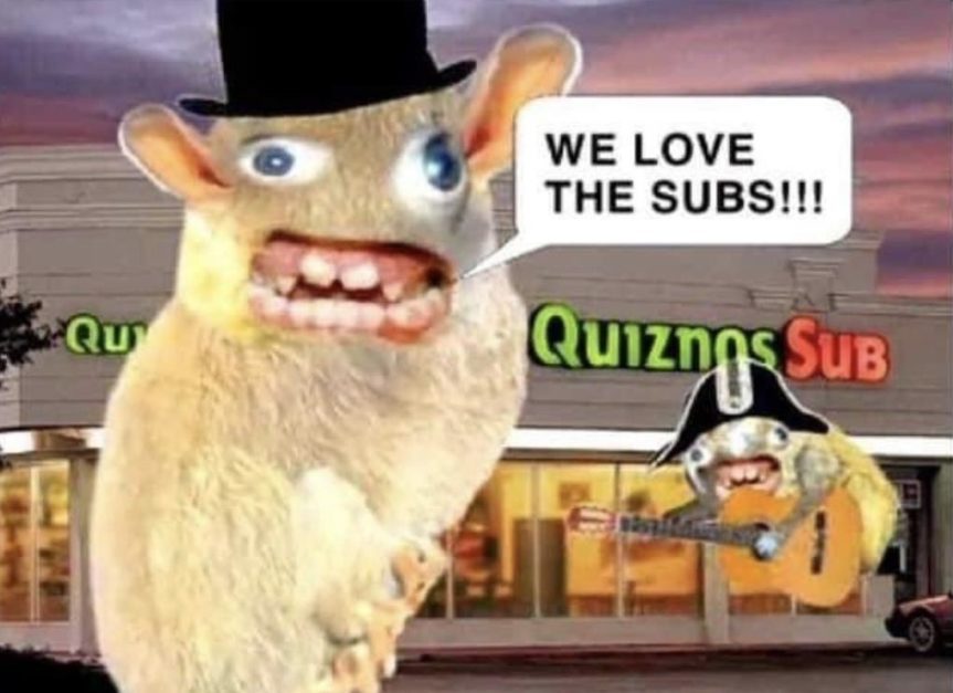
This ad started off as a viral internet meme from 2003 by Joel Veitch with a song called “We Like the Moon”. In 2004 Quiznos briefly adopted the Spongmonkeysm mouse-like creatures with googly eyes and an angry mouth with bad teeth. The mascot has a terrible voice and seems to be deranged while singing “We love the subs! ‘Cuz they are good to us. The Quiznos subs. They are tasty, they are crunchy, they are warm because they toast them. They got a pepper bar!” Spongmonkeys were likely intended to stand out as different to the typical corporate mascot and big budget advertisements of the time, but were not well received and disappeared quickly. That being said, I admit the song is growing on me and is now stuck in my head.
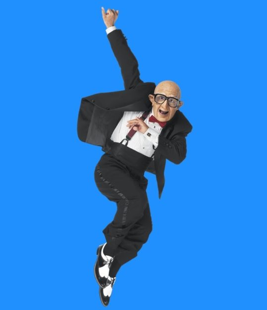
Mr. Six (Six Flags)
Country of origin: United States
Year: 2004-2010
Image: Buzzfeed
If you’re into fun and like to visit theme parks in the USA, perhaps you’ve been to Six Flags. In 2004, the theme park chain started to make commercials with Mr. Six, dancing to “We Like to Party” by The Vengaboys. Mr. Six was a bald old man, who seems to have difficulty walking, but then grooves like a teenager when his favorite song comes up. The creepy old man seemed to be characterized as a pointless character to the brand and has been dubbed as “creepy” by Time Magazine. Consequently, it was deemed an ineffective character and did not turn out into more visits to the park. Why use a creepy old guy to target kids?
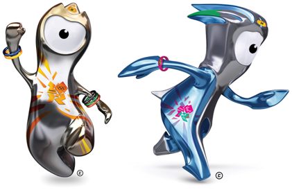
Wenlock and Mandeville (London 2012 Olympic Games)
Country of origin: United Kingdom
Year: 2012
Image: Fast Company
Wenlock and Mandeville came were in ads for the 2012 for the London Olympic Games. The characters were droplets of steel fallen from the stadium according to The Atlantic Cities, but people could not fathom what they really are. Yet, both do not depict any connection to the games at all. It’s weird how these characters had been chosen to represent the games, and the names aren’t memorable for anyone. It feels like the characters were just picked up from an amateur animator and branding agency without any experience making a professional character for any particular brand. As they say, they were a character that has just been picked up from the trash.
Frito Bandito (Frito Lay)
Country of origin: United States
Year: 1967
Image: The Joe Report
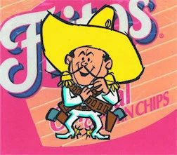
Frito Bandito was a fictional character in Frito Lay chips ads. The character was considered a racist stereotype with an exaggerated Mexican accent and violent demeanor, shooting people just to get his favourite Frito Lay chips. A far cry from the far more popular and well-loved mischeivous Gobbledock example above. While the company wants to show that their snacks are irresistible, it did not positively represent Latin Americans, instead promoting negative racial stereotypes to children of all people. In a deeper sense, it suggested that Mexican were thieves who use violence to get what they want. The character faced opposition from Mexican-American advocacy groups founded in opposition to the use of racist stereotypes in advertising and was modified to remove his beard, gold tooth and pistols, before being pulled altogether in 1971.
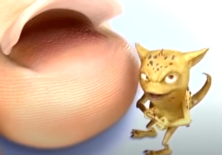
Digger the Dermatophyte / Freddy the Fungus – Lamisil / Stepwise
Country of origin: United States
Year: 2003
Image Source: YouTube
Known as Digger the Dermatophyte in the USA in ads for Lamisil, and Freddy the Fungus for Stepwise in the UK, this creepy little guy is another example of an antagonist mascot. Whilst his design makes sense for what he is and what he is selling, he is most well known for lifting up a toenail and crawling inside to wreak havoc. This imagery in the ad is basically torture to many viewers and almost made me vomit when I saw this for the first time. It’s this association and physical feeling it gave me that makes Digger the Dermatophyte make it onto this list. Apparently, the campaign was successful for the Lamisil, but it is still a hated commercial.
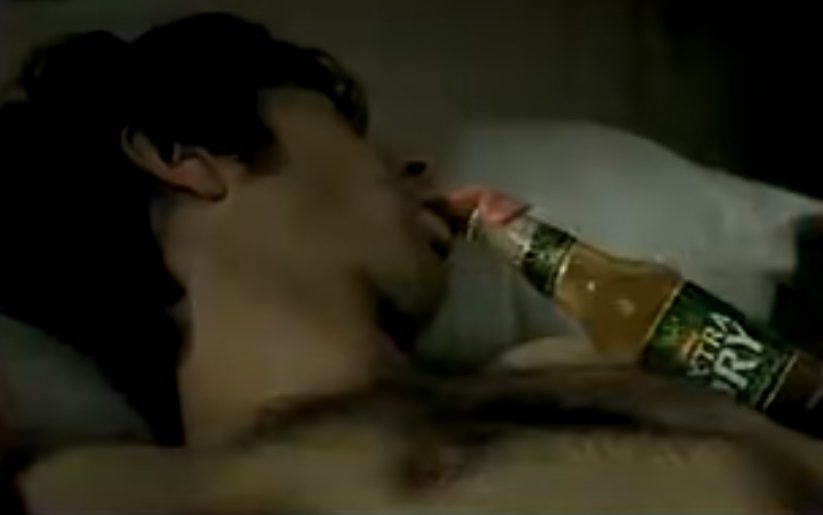
Toohey’s Extra Dry Tongue
Country of origin: Australia
Year: 2003
Image Source: YouTube
Whilst not a long-standing mascot for the Australian beer brand Toohey’s, this ad is notorious for being one of the most uncomfortable and creepy ads in Australian TV history. A sleeping man’s tongue crawls out of his mouth and crawls across town to steal a beer from a party and to bring it back to him in bed. The image of a disembodied tongue crawling across the ground outside is disgusting. I chose a screenshot of the beer returning to the guy’s mouth as I think the previous screenshot was traumatic enough. At least this advertisement was not marketed towards kids.
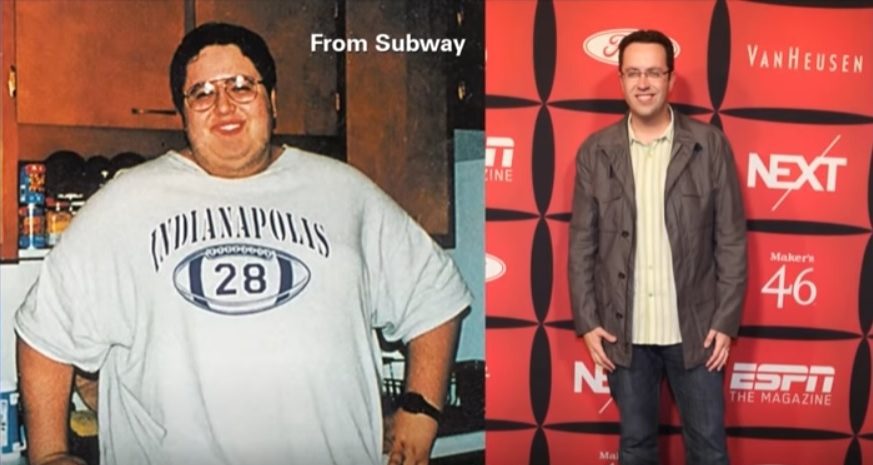
Jared Fogel The Subway Guy
Country of origin: United States
Year: 2000
Image Source: History of Subway’s Controversies and Lawsuits
More Spokesperson than mascot, Jared Fogel was undoubtedly the face of Subway for a decade, and raked in millions doing so. Like Colonel Sanders to KFC or the 1970s-2013 version of Ronald McDonald, his was THE face you associate with this brand, heavily featured in commercials and in in-store promotions. Whilst his inspiring story was great at first, and was in no way problematic at the time, his pedophilia conviction was a PR disaster for the brand. Having the face of your brand be convicted of such crimes puts him on this list retrospectively. It highlights the risk involved with using real people to sell your brand, and why companies are quick to dump celebrities the moment their reputation is tarnished, lest reputation rub off.
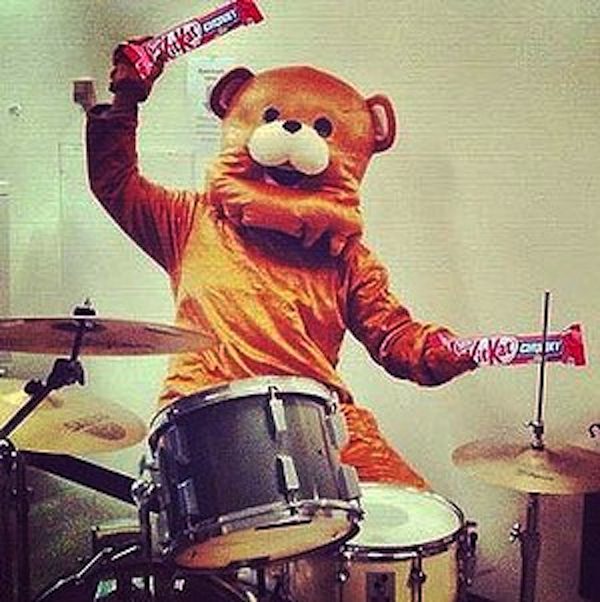
Kit Kat’s Pedobear Mascot (Nestle)
Country of origin: Australia
Year: 2012
Image Source: Instagram/Facebook
A person in a bear suit playing the drums was meant to launch Nestle’s Instagram profile of the Kit Kat brand on Facebook, but it was quickly pulled after a lot of people who pointed out that it looked a lot like Pedobear, the internet meme that warns of pedophiles online. Given the whole Jared from Subway thing above, it’s clear that no brands want to be associated with anything accidentally related this kind of thing… This is perhaps one of the most short-lived mascots ever.
What makes a good brand mascot?
Mascots are a mainstay of branding, giving the face of your brand a…face. Characters must be properly workshopped and tested to ensure they embody the spirit of the brand, and are consistent with other messaging. A good brand mascot uses carefully chosen cues to use our intuition to convey precisely the message a brand is hoping to communicate. Failure can cause damaged brand, reduced brand equity, and cost missions in declining sales. To put it another way, “brand characters are created to promote a brand by establishing brand identity and favourable brand association…they also help brands come alive with human qualities of emotion, thought and personality” (Weszka, 2011). Time and time again we have seen corporations and brand experts with the best of intentions, careful deliberation and millions spent in development launch a mascot to the mass market without sufficient testing and test audience feedback. Mascots that are truly memorable and stand out are usually a frontier of business branding, but there’s a risk.
If you’re ever wondering how an ad, product or mascot did make the cut and got launched, sometimes the fact that it was an idea sold to corporate management, not customers that explains the launch. Yes, sometimes people forget who the customer is, or they make the mistake of thinking they (and their opinions) are representative of the target market.
And that, boys and girls, is how we end up with creepy mascots. Chippie, chippie, chippie!
Further Reading
Famous Marketing Language Translation Blunders | Good Bad Marketing
